In this issue
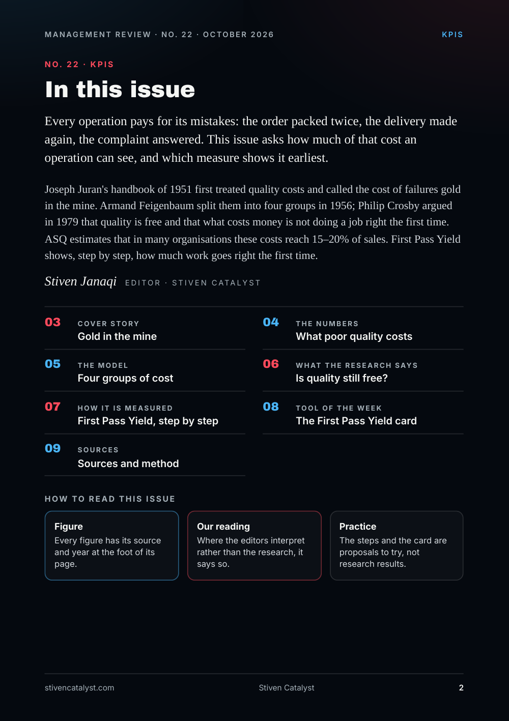
Every operation pays for its mistakes: the order packed twice, the delivery made again, the complaint answered. This issue asks how much of that cost an operation can see, and which measure shows it earliest.
Joseph Juran's handbook of 1951 first treated quality costs and called the cost of failures gold in the mine. Armand Feigenbaum split them into four groups in 1956; Philip Crosby argued in 1979 that quality is free and that what costs money is not doing a job right the first time. ASQ estimates that in many organisations these costs reach 15–20% of sales. First Pass Yield shows, step by step, how much work goes right the first time.
Stiven Janaqi, Editor
Cover story
Gold in the mine
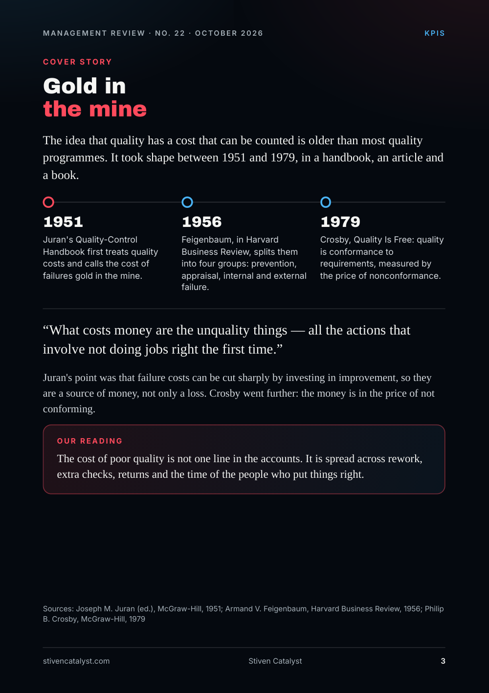
The idea that quality has a cost that can be counted is older than most quality programmes. It took shape between 1951 and 1979, in a handbook, an article and a book.
- 1951 Juran's Quality-Control Handbook first treats quality costs and calls the cost of failures gold in the mine.
- 1956 Feigenbaum, in Harvard Business Review, splits them into four groups: prevention, appraisal, internal and external failure.
- 1979 Crosby, Quality Is Free: quality is conformance to requirements, measured by the price of nonconformance.
What costs money are the unquality things — all the actions that involve not doing jobs right the first time.
Juran's point was that failure costs can be cut sharply by investing in improvement, so they are a source of money, not only a loss. Crosby went further: the money is in the price of not conforming.
Our reading
The cost of poor quality is not one line in the accounts. It is spread across rework, extra checks, returns and the time of the people who put things right.
Sources: Joseph M. Juran (ed.), McGraw-Hill, 1951; Armand V. Feigenbaum, Harvard Business Review, 1956; Philip B. Crosby, McGraw-Hill, 1979
The numbers
What poor qualit y costs
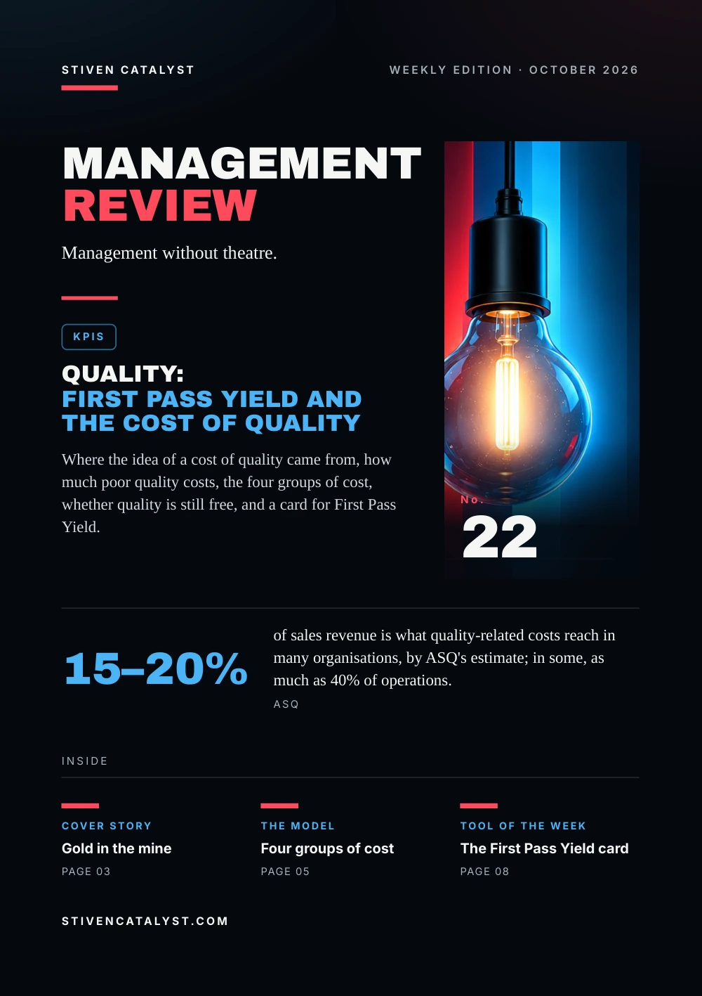
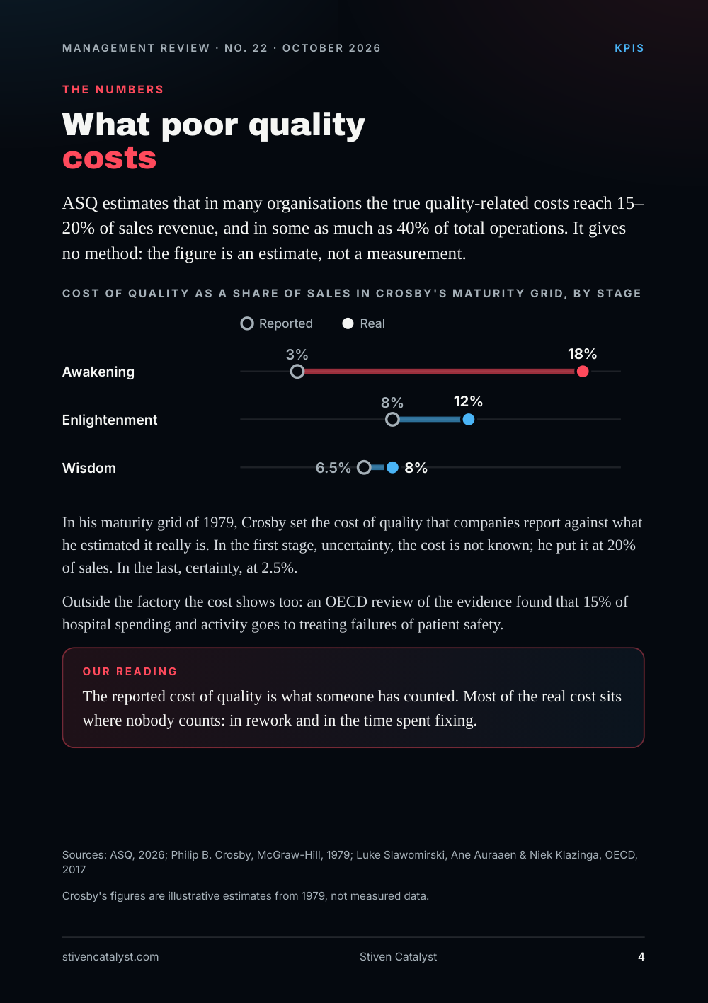
ASQ estimates that in many organisations the true quality-related costs reach 15–20% of sales revenue, and in some as much as 40% of total operations. It gives no method: the figure is an estimate, not a measurement.
Cost of quality as a share of sales in Crosby's maturity grid, by stage: Awakening: Reported 3%, Real 18%; Enlightenment: Reported 8%, Real 12%; Wisdom: Reported 6.5%, Real 8%.
In his maturity grid of 1979, Crosby set the cost of quality that companies report against what he estimated it really is. In the first stage, uncertainty, the cost is not known; he put it at 20% of sales. In the last, certainty, at 2.5%.
Outside the factory the cost shows too: an OECD review of the evidence found that 15% of hospital spending and activity goes to treating failures of patient safety.
Our reading
The reported cost of quality is what someone has counted. Most of the real cost sits where nobody counts: in rework and in the time spent fixing.
Crosby's figures are illustrative estimates from 1979, not measured data.
Sources: ASQ, 2026; Philip B. Crosby, McGraw-Hill, 1979; Luke Slawomirski, Ane Auraaen & Niek Klazinga, OECD, 2017
The model
Four groups of cost
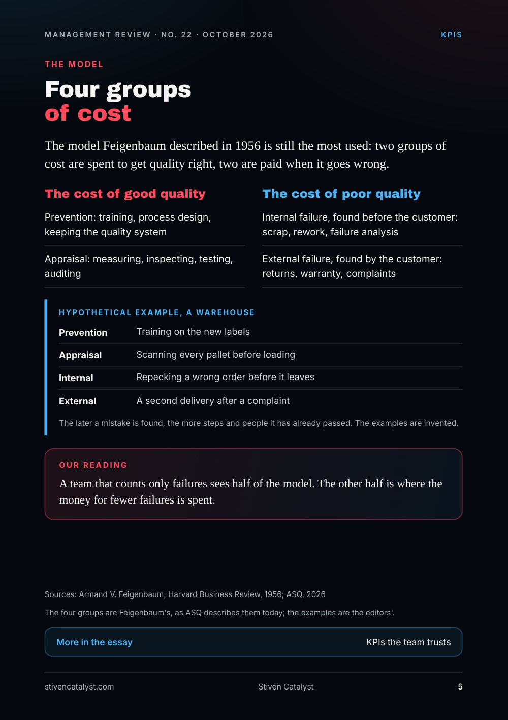
The model Feigenbaum described in 1956 is still the most used: two groups of cost are spent to get quality right, two are paid when it goes wrong.
The cost of good qualit y
- Prevention: training, process design, keeping the quality system
- Appraisal: measuring, inspecting, testing, auditing
The cost of poor qualit y
- Internal failure, found before the customer: scrap, rework, failure analysis
- External failure, found by the customer: returns, warranty, complaints
Hypothe tical example, a warehouse
- Prevention: Training on the new labels
- Appraisal: Scanning every pallet before loading
- Internal: Repacking a wrong order before it leaves
- External: A second delivery after a complaint
The later a mistake is found, the more steps and people it has already passed. The examples are invented.
Our reading
A team that counts only failures sees half of the model. The other half is where the money for fewer failures is spent.
The four groups are Feigenbaum's, as ASQ describes them today; the examples are the editors'.
Sources: Armand V. Feigenbaum, Harvard Business Review, 1956; ASQ, 2026
More in the essay: KPIs the team trusts
What the research says
Is qualit y still free?
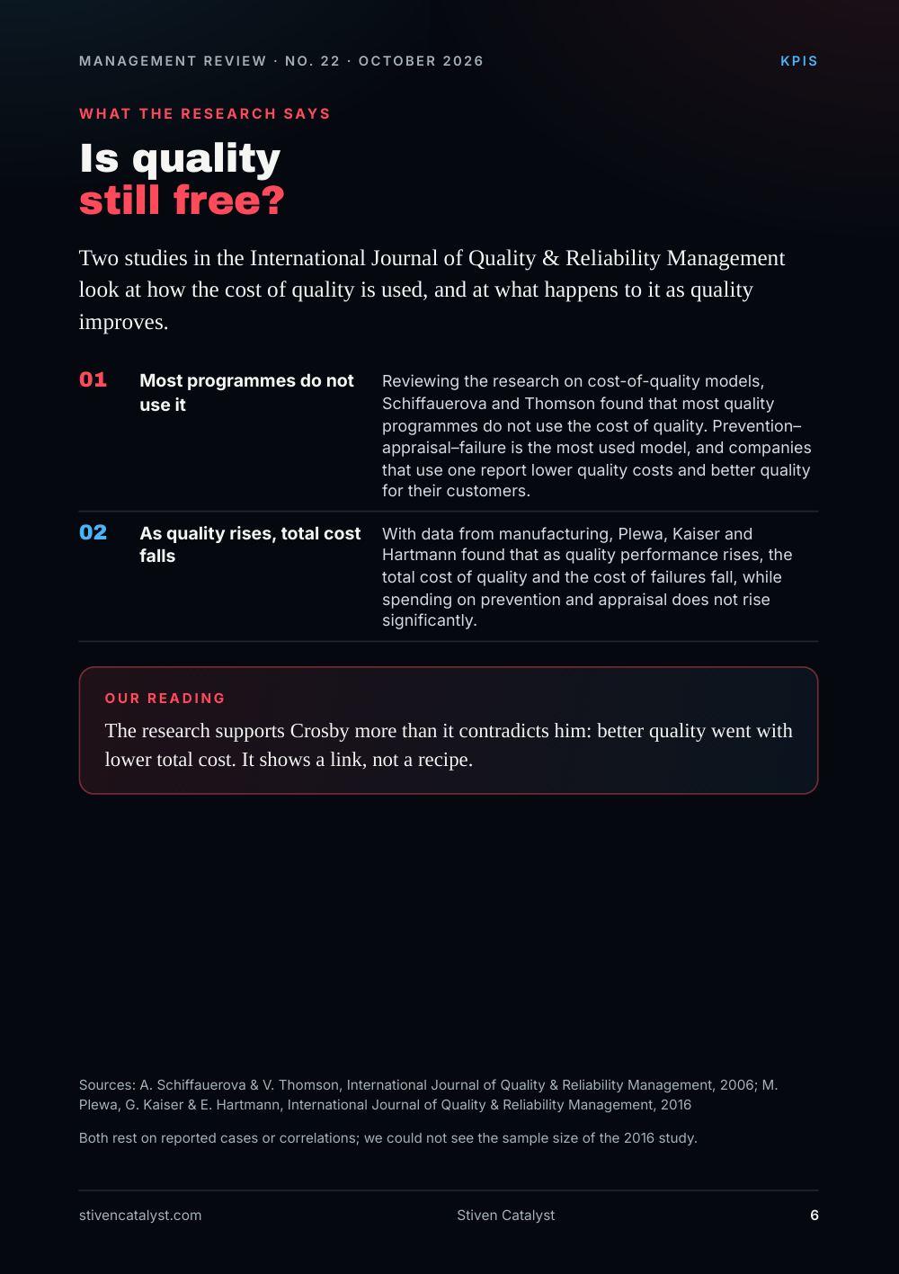
Two studies in the International Journal of Quality & Reliability Management look at how the cost of quality is used, and at what happens to it as quality improves.
- Most programmes do not use it. Reviewing the research on cost-of-quality models, Schiffauerova and Thomson found that most quality programmes do not use the cost of quality. Prevention–appraisal–failure is the most used model, and companies that use one report lower quality costs and better quality for their customers.
- As quali
t y rises,t otal cost falls. With data from manufacturing, Plewa, Kaiser and Hartmann found that as quality performance rises, the total cost of quality and the cost of failures fall, while spending on prevention and appraisal does not rise significantly.
Our reading
The research supports Crosby more than it contradicts him: better quality went with lower total cost. It shows a link, not a recipe.
Both rest on reported cases or correlations; we could not see the sample size of the 2016 study.
Sources: A. Schiffauerova & V. Thomson, International Journal of Quality & Reliability Management, 2006; M. Plewa, G. Kaiser & E. Hartmann, International Journal of Quality & Reliability Management, 2016
How it is measured
First Pass Yield, step by step
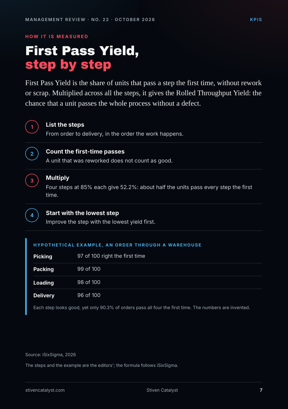
First Pass Yield is the share of units that pass a step the first time, without rework or scrap. Multiplied across all the steps, it gives the Rolled Throughput Yield: the chance that a unit passes the whole process without a defect.
- List the steps. From order to delivery, in the order the work happens.
- Count the first-time passes. A unit that was reworked does not count as good.
- Multiply. Four steps at 85% each give 52.2%: about half the units pass every step the first time.
- Sta
r t with the lowest step. Improve the step with the lowest yield first.
Hypothe tical example, an order through a warehouse
- Picking: 97 of 100 right the first time
- Packing: 99 of 100
- Loading: 98 of 100
- Delivery: 96 of 100
Each step looks good, yet only 90.3% of orders pass all four the first time. The numbers are invented.
The steps and the example are the editors'; the formula follows iSixSigma.
Source: iSixSigma, 2026
Tool of the week
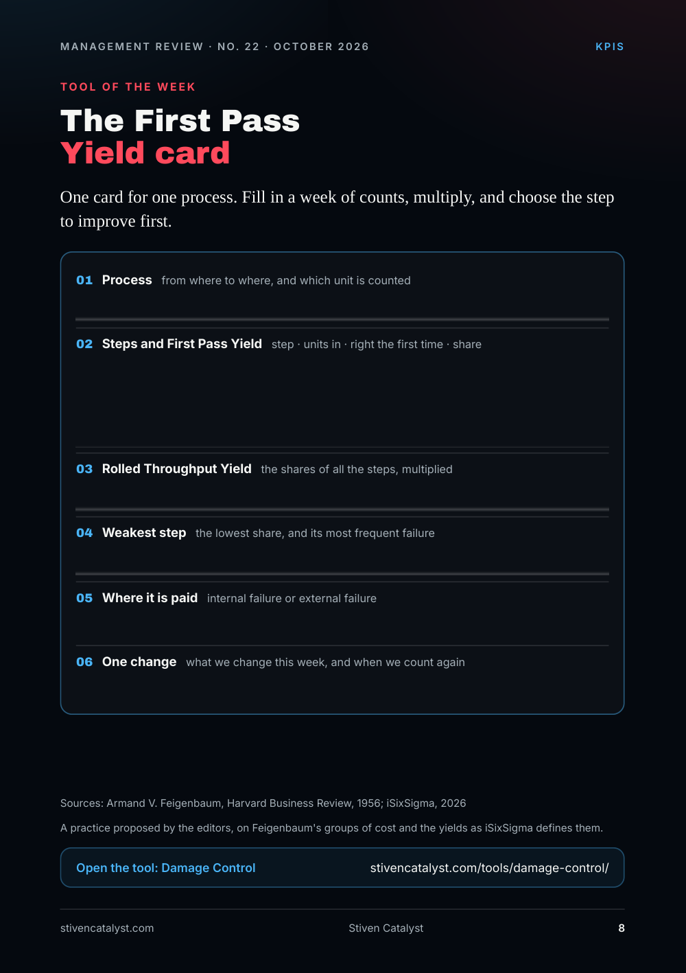
The First Pass Yield card
One card for one process. Fill in a week of counts, multiply, and choose the step to improve first.
- Process from where to where, and which unit is counted
- Steps and First Pass Yield step · units in · right the first time · share
- Rolled Throughput Yield the shares of all the steps, multiplied
- Weakest step the lowest share, and its most frequent failure
- Where it is paid internal failure or external failure
- One change what we change this week, and when we count again
A practice proposed by the editors, on Feigenbaum's groups of cost and the yields as iSixSigma defines them.
Sources: Armand V. Feigenbaum, Harvard Business Review, 1956; iSixSigma, 2026
Open the tool: Damage Control
Sources and method
Every figure has a source.
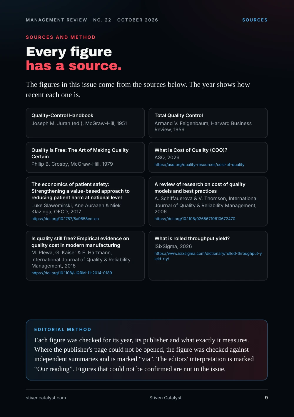
The figures in this issue come from the sources below. The year shows how recent each one is.
- Joseph M. Juran (ed.), McGraw-Hill, “Quality-Control Handbook”, 1951.
- Armand V. Feigenbaum, Harvard Business Review, “Total Quality Control”, 1956.
- Philip B. Crosby, McGraw-Hill, “Quality Is Free: The Art of Making Quality Certain”, 1979.
- ASQ, “What is Cost of Quality (COQ)?”, 2026. https://asq.org/quality-resources/cost-of-quality
- Luke Slawomirski, Ane Auraaen & Niek Klazinga, OECD, “The economics of patient safety: Strengthening a value-based approach to reducing patient harm at national level”, 2017. https://doi.org/10.1787/5a9858cd-en
- A. Schiffauerova & V. Thomson, International Journal of Quality & Reliability Management, “A review of research on cost of quality models and best practices”, 2006. https://doi.org/10.1108/02656710610672470
- M. Plewa, G. Kaiser & E. Hartmann, International Journal of Quality & Reliability Management, “Is quality still free? Empirical evidence on quality cost in modern manufacturing”, 2016. https://doi.org/10.1108/IJQRM-11-2014-0189
- iSixSigma, “What is rolled throughput yield?”, 2026. https://www.isixsigma.com/dictionary/rolled-throughput-yield-rty/
Edit orial me thod
Each figure was checked for its year, its publisher and what exactly it measures. Where the publisher's page could not be opened, the figure was checked against independent summaries and is marked “via”. The editors' interpretation is marked “Our reading”. Figures that could not be confirmed are not in the issue.