Stephen Few's definition is narrow: the most important information on one screen, monitored at a glance. In a 2019 survey of 9,000 employees in nine countries, 21% were confident in their data literacy and 74% felt overwhelmed or unhappy working with data. In Finland only about a quarter of the sales managers who answered a 2010 survey used a dashboard. Few's bullet graph replaces the gauge with one line, and a review of health care studies links dashboards that are easy to reach with better care.
Management Review · First series · October 2026 · No. 37
Dashboards that ge t used
Few's one screen at a glance, how sure people feel with data, the bullet graph, who uses dashboards and for what, five design mistakes, and a card for a dashboard that gets used.
- No.
- 37
- Pages
- 10
- Sources
- 7
- Topics
- KPIs
Stiven CatalystFirst series · October 2026
ManagementReview
Management without theatre.
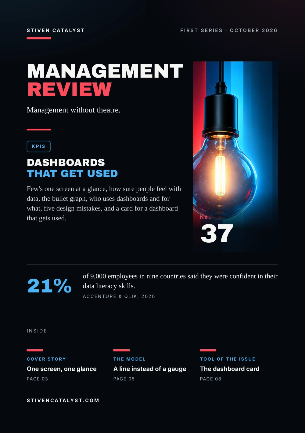
KPIs
Dashboardsthat get used
Few's one screen at a glance, how sure people feel with data, the bullet graph, who uses dashboards and for what, five design mistakes, and a card for a dashboard that gets used.

No.37
21%
of 9,000 employees in nine countries said they were confident in their data literacy skills.Accenture & Qlik, 2020
stivencatalyst.com
No. 37 · KPIs
In this issue
Many companies have more dashboards than decisions. This issue asks what a dashboard is for, who can read it, who actually uses it, and how to tell a screen that gets used from one that is merely switched on.
- 03Cover storyOne screen, one glance
- 04The numbersData that overwhelm
- 05The modelA line instead of a gauge
- 06What the research saysWho uses them, and for what
- 07How it is measuredIs anyone looking?
- 08Tool of the issueThe dashboard card
- 09SourcesSources and method
How to read this issue
Figure
Every figure has its source and year at the foot of its page.
Our reading
Where the editors interpret rather than the research, it says so.
Practice
The steps and the card are proposals to try, not research results.
Cover story
One screen,one glance
In 2004 Stephen Few defined a dashboard narrowly: a visual display of the most important information needed to reach one or more objectives, arranged on a single screen so it can be monitored at a glance.
01
The most important
what the objectives need, not everything that can be measured
02
One screen
no scrolling, no switching: short-term memory holds little
03
At a glance
summaries and exceptions, read in an instant
Later Few sharpened it: a mainly visual display that people use to monitor current conditions rapidly, conditions that need a timely response in a specific role. By that test, he wrote in 2017, only 2 of the 28 examples in The Big Book of Dashboards were rapid-monitoring displays; the others may be useful, but they serve other purposes.
Our reading
A screen full of charts is not yet a dashboard. Ask who looks at it, how often, and what they do next.
Sources: Stephen Few, Perceptual Edge, 2017; Stephen Few, O'Reilly Media (2nd ed. 2013, Analytics Press), 2006 (via UXmatters, 2007)
The definitions are Few's; the 2004 wording was checked where he quotes it himself in 2017. The count of 2 in 28 is his judgement of another book, not a measurement.
The numbers
Data thatoverwhelm
In September 2019 Opinium surveyed 9,000 full-time employees in nine countries, Germany among them, for Accenture and Qlik. Most saw data as an asset; few felt sure using it.
Employees in nine countries, September 2019 (self-reported)
In a 2022 Forrester Consulting survey for Tableau of more than 2,000 people in ten countries, 82% of decision-makers expected basic data literacy in every department, but only 39% of organisations offered data training to all employees.
Our reading
Dashboards are read by people, not by software. A clear screen does not help someone who avoids numbers.
Sources: Accenture & Qlik for The Data Literacy Project, survey by Opinium, 2020; Forrester Consulting, commissioned by Tableau, 2022 (via Help Net Security, 2022)
Both studies were commissioned by firms that sell analytics software, and both rest on self-reports. For Albania we have no comparable figure.
The model
A line insteadof a gauge
Few designed the bullet graph to replace the meters and gauges common on dashboards. In a small space it shows one measure, compares it with a target and places it in ranges such as poor, satisfactory and good.
- 01
Label
names the measure
- 02
Scale
one linear axis, usually from zero
- 03
Measure
a dark bar, the most visible part
- 04
Comparison
a short cross line: target or last year
- 05
Ranges
two to five shades, ideally three
Few advises shades of one colour, dark for poor and light for good, rather than separate hues that people with colour blindness may not tell apart. A linear design, he writes, also takes less space and is read more efficiently than a round gauge.
Hypothetical example, one line on a shift dashboard
- Measure
- on-time departures this week: 91%
- Target
- a cross line at 95%
- Ranges
- below 85% poor, 85–95% satisfactory, above 95% good
One line: below target, in the middle range. The figures are invented.
Source: Stephen Few, Perceptual Edge, 2013
The parts and defaults follow Few's design specification (2006, revised 2013). The colour advice is his recommendation, not a tested standard.
What the research says
Who uses them,and for what
At the end of 2010 Oana Velcu-Laitinen and Ogan Yigitbasioglu surveyed senior sales managers at 851 Finnish companies about dashboards. 145 answered, and only about a quarter of them used one.
Sales managers who answered, Finland, end of 2010 (number, of 145)
Seven of the 36 had built theirs in Excel. Users ranked communication and consistency first of four purposes, ahead of monitoring, and data quality went with use. A 2015 review of 11 health care studies found that where clinicians could reach dashboards easily, as a screen saver for example, use went with better care processes and patient outcomes.
Our reading
A dashboard people have to go looking for is rarely looked at. Put it where the work happens.
Sources: Oana Velcu-Laitinen & Ogan M. Yigitbasioglu, International Journal of Digital Accounting Research, 2012; Dawn Dowding et al., International Journal of Medical Informatics, 2015
A small sample (17% responded) and correlations, not proof of cause; 47 is the rest of the 109 non-users. The health care review calls the evidence limited.
How it is measured
Is anyonelooking?
A dashboard can be checked twice: against Few's list of common design mistakes, and against what people do with it. The first takes an hour; the second takes a month of meetings.
Five of Few's thirteen common mistakes
- exceeding the boundaries of one screen
- too little context: no target, no comparison
- excessive detail or precision
- a deficient measure
- misusing or overusing colour
Name the user and the decision
If no one can say which decision a number serves, it belongs in a report.
Count actions, not views
In each review, note which number led to a step, an owner and a date.
Remove what no one used
A measure that triggered nothing for a quarter leaves the screen.
Source: Stephen Few, O'Reilly Media (2nd ed. 2013, Analytics Press), 2006 (via UXmatters, 2007)
The mistakes are from Few (2006); the steps are the editors' proposal, not a tested method.
More in the essayKPIs do not improve in Excel
Tool of the issue
The dashboardcard
Fill it in before you build the screen, and again after a month. If a line stays empty, the dashboard is not ready.
01Who looks at itthe role, and how often: every shift, day or week
02The decision it servesone sentence: what changes when the number moves
03Three to five measureseach with its definition and its source
04The comparisontarget, last week or last year, for every measure
05When it is readthe meeting or the moment, and who leads it
06What triggers actionthe threshold, who acts, by when
07What we removedmeasures that led to no action in a month
Sources: Stephen Few, Perceptual Edge, 2017; Stephen Few, O'Reilly Media (2nd ed. 2013, Analytics Press), 2006 (via UXmatters, 2007)
A practice proposed by the editors, after Few's definition of a dashboard (2004, 2017) and his book (2006).
Open the tool: Shift Pulsestivencatalyst.com/tools/shift-pulse/
Sources and method
Every figurehas a source.
The figures in this issue come from the sources below. The year shows how recent each one is.
- Information Dashboard Design: The Effective Visual Communication of DataStephen Few, O'Reilly Media (2nd ed. 2013, Analytics Press), 2006 · via UXmatters, 2007
- There's Nothing Mere About SemanticsStephen Few, Perceptual Edge, 2017https://www.perceptualedge.com/blog/?p=2793
- The Human Impact of Data LiteracyAccenture & Qlik for The Data Literacy Project, survey by Opinium, 2020https://www.qlik.com/us/news/company/press-room/press-releases/data-skills-gap-is-costing-organizations-billions-in-lost-productivity
- Building Data Literacy: The Key to Better Decisions, Greater Productivity, and Data-Driven OrganizationsForrester Consulting, commissioned by Tableau, 2022 · via Help Net Security, 2022
- Bullet Graph Design SpecificationStephen Few, Perceptual Edge, 2013https://www.perceptualedge.com/articles/misc/Bullet_Graph_Design_Spec.pdf
- The Use of Dashboards in Performance Management: Evidence from Sales ManagersOana Velcu-Laitinen & Ogan M. Yigitbasioglu, International Journal of Digital Accounting Research, 2012https://doi.org/10.4192/1577-8517-v12_2
- Dashboards for improving patient care: Review of the literatureDawn Dowding et al., International Journal of Medical Informatics, 2015https://eprints.whiterose.ac.uk/84905/
Editorial method
Each figure was checked for its year, its publisher and what exactly it measures. Where the publisher's page could not be opened, the figure was checked against independent summaries and is marked “via”. The editors' interpretation is marked “Our reading”. Figures that could not be confirmed are not in the issue.
ManagementReview
Management without theatre.
Every issue, one management question, checked against the best research.
All issues
stivencatalyst.com/magazine/management-review.html
Management Review · No. 37 · October 2026 · Stiven Catalyst
Click or swipe a page to turn it. The arrow keys work too.
Management Review · No. 37
The figures of the issue
The charts of the printed pages, with their sources.
Source: Accenture & Qlik for The Data Literacy Project, survey by Opinium, 2020
Source: Oana Velcu-Laitinen & Ogan M. Yigitbasioglu, International Journal of Digital Accounting Research, 2012
The whole text Read the issue as text For reading on a small screen, searching or a screen reader. The same words, without the page design.
In this issue
Many companies have more dashboards than decisions. This issue asks what a dashboard is for, who can read it, who actually uses it, and how to tell a screen that gets used from one that is merely switched on.
Stephen Few's definition is narrow: the most important information on one screen, monitored at a glance. In a 2019 survey of 9,000 employees in nine countries, 21% were confident in their data literacy and 74% felt overwhelmed or unhappy working with data. In Finland only about a quarter of the sales managers who answered a 2010 survey used a dashboard. Few's bullet graph replaces the gauge with one line, and a review of health care studies links dashboards that are easy to reach with better care.
Stiven Janaqi, Editor
Cover story
One screen, one glance
In 2004 Stephen Few defined a dashboard narrowly: a visual display of the most important information needed to reach one or more objectives, arranged on a single screen so it can be monitored at a glance.
- The most impo
r tant. what the objectives need, not everything that can be measured - One screen. no scrolling, no switching: short-term memory holds little
- At a glance. summaries and exceptions, read in an instant
Later Few sharpened it: a mainly visual display that people use to monitor current conditions rapidly, conditions that need a timely response in a specific role. By that test, he wrote in 2017, only 2 of the 28 examples in The Big Book of Dashboards were rapid-monitoring displays; the others may be useful, but they serve other purposes.
Our reading
A screen full of charts is not yet a dashboard. Ask who looks at it, how often, and what they do next.
The definitions are Few's; the 2004 wording was checked where he quotes it himself in 2017. The count of 2 in 28 is his judgement of another book, not a measurement.
Sources: Stephen Few, Perceptual Edge, 2017; Stephen Few, O'Reilly Media (2nd ed. 2013, Analytics Press), 2006 (via UXmatters, 2007)
The numbers
Data that overwhelm
In September 2019 Opinium surveyed 9,000 full-time employees in nine countries, Germany among them, for Accenture and Qlik. Most saw data as an asset; few felt sure using it.
Employees in nine countries, September 2019 (self-reported): See data as an asset 87%, Overwhelmed or unhappy working with data 74%, Often trust a gut feeling instead of data 48%, Confident in their data literacy 21%.
In a 2022 Forrester Consulting survey for Tableau of more than 2,000 people in ten countries, 82% of decision-makers expected basic data literacy in every department, but only 39% of organisations offered data training to all employees.
Our reading
Dashboards are read by people, not by software. A clear screen does not help someone who avoids numbers.
Both studies were commissioned by firms that sell analytics software, and both rest on self-reports. For Albania we have no comparable figure.
Sources: Accenture & Qlik for The Data Literacy Project, survey by Opinium, 2020; Forrester Consulting, commissioned by Tableau, 2022 (via Help Net Security, 2022)
The model
A line instead of a gauge
Few designed the bullet graph to replace the meters and gauges common on dashboards. In a small space it shows one measure, compares it with a target and places it in ranges such as poor, satisfactory and good.
- Label. names the measure
- Scale. one linear axis, usually from zero
- Measure. a dark bar, the most visible part
- Comparison. a short cross line: target or last year
- Ranges. two to five shades, ideally three
Few advises shades of one colour, dark for poor and light for good, rather than separate hues that people with colour blindness may not tell apart. A linear design, he writes, also takes less space and is read more efficiently than a round gauge.
Hypothe tical example, one line on a shif t dashboard
- Measure: on-time departures this week: 91%
- Targ
e t: a cross line at 95% - Ranges: below 85% poor, 85–95% satisfactory, above 95% good
One line: below target, in the middle range. The figures are invented.
The parts and defaults follow Few's design specification (2006, revised 2013). The colour advice is his recommendation, not a tested standard.
Source: Stephen Few, Perceptual Edge, 2013
What the research says
Who uses them, and for what
At the end of 2010 Oana Velcu-Laitinen and Ogan Yigitbasioglu surveyed senior sales managers at 851 Finnish companies about dashboards. 145 answered, and only about a quarter of them used one.
Sales managers who answered, Finland, end of 2010 (number, of 145): Used a dashboard 36, Used other reporting tools instead 62, Other non-users 47.
Seven of the 36 had built theirs in Excel. Users ranked communication and consistency first of four purposes, ahead of monitoring, and data quality went with use. A 2015 review of 11 health care studies found that where clinicians could reach dashboards easily, as a screen saver for example, use went with better care processes and patient outcomes.
Our reading
A dashboard people have to go looking for is rarely looked at. Put it where the work happens.
A small sample (17% responded) and correlations, not proof of cause; 47 is the rest of the 109 non-users. The health care review calls the evidence limited.
Sources: Oana Velcu-Laitinen & Ogan M. Yigitbasioglu, International Journal of Digital Accounting Research, 2012; Dawn Dowding et al., International Journal of Medical Informatics, 2015
How it is measured
Is anyone looking?
A dashboard can be checked twice: against Few's list of common design mistakes, and against what people do with it. The first takes an hour; the second takes a month of meetings.
Five of Few's thir teen common mistakes
- exceeding the boundaries of one screen
- too little context: no target, no comparison
- excessive detail or precision
- a deficient measure
- misusing or overusing colour
- Name the user and the decision. If no one can say which decision a number serves, it belongs in a report.
- Count actions, not views. In each review, note which number led to a step, an owner and a date.
- Remove what no one used. A measure that triggered nothing for a quarter leaves the screen.
The mistakes are from Few (2006); the steps are the editors' proposal, not a tested method.
Source: Stephen Few, O'Reilly Media (2nd ed. 2013, Analytics Press), 2006 (via UXmatters, 2007)
More in the essay: KPIs do not improve in Excel
Tool of the issue
The dashboard card
Fill it in before you build the screen, and again after a month. If a line stays empty, the dashboard is not ready.
- Who looks at it the role, and how often: every shift, day or week
- The decision it serves one sentence: what changes when the number moves
- Three
t o five measures each with its definition and its source - The comparison target, last week or last year, for every measure
- When it is read the meeting or the moment, and who leads it
- What triggers action the threshold, who acts, by when
- What we removed measures that led to no action in a month
A practice proposed by the editors, after Few's definition of a dashboard (2004, 2017) and his book (2006).
Sources: Stephen Few, Perceptual Edge, 2017; Stephen Few, O'Reilly Media (2nd ed. 2013, Analytics Press), 2006 (via UXmatters, 2007)
Open the tool: Shift Pulse
Sources and method
Every figure has a source.
The figures in this issue come from the sources below. The year shows how recent each one is.
- Stephen Few, O'Reilly Media (2nd ed. 2013, Analytics Press), “Information Dashboard Design: The Effective Visual Communication of Data”, 2006 (via UXmatters, 2007).
- Stephen Few, Perceptual Edge, “There's Nothing Mere About Semantics”, 2017. https://www.perceptualedge.com/blog/?p=2793
- Accenture & Qlik for The Data Literacy Project, survey by Opinium, “The Human Impact of Data Literacy”, 2020. https://www.qlik.com/us/news/company/press-room/press-releases/data-skills-gap-is-costing-organizations-billions-in-lost-productivity
- Forrester Consulting, commissioned by Tableau, “Building Data Literacy: The Key to Better Decisions, Greater Productivity, and Data-Driven Organizations”, 2022 (via Help Net Security, 2022).
- Stephen Few, Perceptual Edge, “Bullet Graph Design Specification”, 2013. https://www.perceptualedge.com/articles/misc/Bullet_Graph_Design_Spec.pdf
- Oana Velcu-Laitinen & Ogan M. Yigitbasioglu, International Journal of Digital Accounting Research, “The Use of Dashboards in Performance Management: Evidence from Sales Managers”, 2012. https://doi.org/10.4192/1577-8517-v12_2
- Dawn Dowding et al., International Journal of Medical Informatics, “Dashboards for improving patient care: Review of the literature”, 2015. https://eprints.whiterose.ac.uk/84905/
Edit orial me thod
Each figure was checked for its year, its publisher and what exactly it measures. Where the publisher's page could not be opened, the figure was checked against independent summaries and is marked “via”. The editors' interpretation is marked “Our reading”. Figures that could not be confirmed are not in the issue.
Management Review · Monthly edition